Thin Line Icons: The Versatile Visual Language for Business, Lifestyle, and Modern Communication
Imagine explaining complex financial trends in a single slide—or guiding users through a wellness app with intuitive, uncluttered visuals. Or picture an educator simplifying climate science for students using clean, universally recognizable symbols. Behind these seamless experiences often lies a quiet but powerful design tool: thin line icons. More than just decorative elements, these minimalist glyphs form a cohesive visual vocabulary—especially when curated into purpose-built collections like the Business and Lifestyle Lin set. Designed with precision and intention, this collection spans business, finance, health, environment, education, and everyday objects—making it indispensable for infographics, web interfaces, dashboards, presentations, and responsive digital products.
What Are Thin Line Icons—and Why Do They Matter?
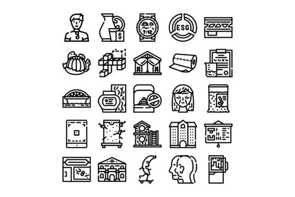
Thin line icons are vector-based graphical symbols rendered with consistent stroke widths (typically 1–2 px), minimal detail, and open, airy forms. Unlike filled or bold icons, they prioritize clarity over ornamentation—relying on shape recognition rather than color or texture. Their lightweight aesthetic supports scalability, accessibility, and cross-platform consistency. When grouped into a thoughtfully organized collection—like the Business and Lifestyle Lin series—they become more than isolated graphics; they become a system.
This system approach is key. Rather than sourcing mismatched icons from disparate libraries, designers and communicators benefit from unified proportions, spacing, corner radii, and visual rhythm. That consistency builds trust, improves scannability, and strengthens brand coherence—especially in data-rich contexts like financial reports or public health dashboards.
Purpose Beyond Aesthetics: Function First
The primary purpose of thin line icons isn’t decoration—it’s communication efficiency. In fast-paced digital environments, users process visual cues up to 60,000 times faster than text. A well-placed icon can replace a sentence, clarify hierarchy, or signal interactivity without language barriers. For example:
- A thin line chart icon next to “Q3 Revenue” instantly signals data visualization—not just “report.”
- A leaf-and-gear icon subtly conveys “sustainable operations,” bridging environment and business strategy.
- A stacked book icon with a graduation cap communicates “lifelong learning” more accessibly than jargon like “pedagogical upskilling.”
Crucially, thin line icons support inclusivity. Their simplicity aids screen readers (when properly labeled), benefits users with cognitive differences, and ensures legibility at small sizes—on mobile notifications, wearable displays, or low-bandwidth interfaces.
Business & Finance: Clarity in Complexity
Financial concepts—cash flow, ROI, risk assessment—are abstract and often intimidating. Thin line icons demystify them. A balance scale icon paired with “equity allocation” visually anchors fairness and balance. A shield-with-graph icon reinforces “risk mitigation strategy” more effectively than bullet points alone. In investor decks or SaaS onboarding flows, these icons reduce cognitive load while preserving professional tone.
Health & Wellness: Empathy Through Simplicity
Health communication demands both accuracy and sensitivity. A heart-rate waveform icon is more precise—and less clinical—than a generic heart. A sleep-cycle moon-and-sun icon gently suggests circadian rhythm without medical terminology. These icons appear in telehealth apps, corporate wellness portals, and public health campaigns—where clarity directly impacts behavior change and compliance.
Environment & Sustainability: Making Impact Visible
Climate action relies on shared understanding. Thin line icons help translate macro issues into micro actions: a recycle arrow encircling a leaf merges circular economy and ecology; a thermometer with rising mercury and CO₂ molecules visualizes warming trends without alarmist imagery. Educators use such icons in sustainability curricula; municipalities embed them in recycling signage; startups feature them in ESG reports to demonstrate transparency.
Education & Learning: Supporting Cognitive Load Theory
Research shows learners retain information better when visuals align with verbal content (Mayer’s Multimedia Principle). Thin line icons serve as “visual anchors” in e-learning modules—e.g., a lightbulb-with-pen icon marking “key insight,” or a group-of-people icon with speech bubbles indicating “collaborative activity.” Their neutrality avoids cultural bias, making them ideal for global EdTech platforms.
Daily Objects & Lifestyle: Human-Centered Design at Scale
From smart home interfaces to meal-planning apps, thin line icons ground digital tools in real life. A coffee cup with steam curl, a bicycle with leafy trail, or a calendar with checkmark convey routine, choice, and intentionality. Unlike photorealistic assets, they avoid distracting detail—keeping focus on user goals, not graphic fidelity.
Why the “Business and Lifestyle Lin” Collection Stands Out
Not all icon sets deliver equal utility. The Business and Lifestyle Lin collection distinguishes itself through three core strengths:
- Domain-Specific Cohesion: Icons aren’t randomly assembled—they’re grouped by semantic clusters (e.g., “Finance Operations,” “Mental Wellbeing,” “Green Infrastructure”) so users can find related concepts intuitively.
- Contextual Flexibility: Each icon works equally well in light/dark modes, monochrome print, SVG animations, or as part of larger illustrated infographics.
- Future-Ready Licensing: With commercial-use rights, scalable vector formats (SVG, Figma, Sketch), and regular updates—including emerging topics like AI ethics or regenerative agriculture—the collection evolves alongside industry needs.
Common Misconceptions—Clarified
Misconception: “Thin line icons lack personality or brand voice.”
Reality: Personality emerges through thoughtful application—not visual density. A fintech startup might pair thin line icons with bold typography and strategic accent color to project innovation and trust. Minimalism enables adaptability, not blandness.
Misconception: “They’re only for designers.”
Reality: Marketers use them in social carousels; HR teams embed them in remote-work playbooks; teachers insert them into Google Slides; founders sketch them in pitch decks. No design degree required—just an eye for clarity.
Misconception: “One icon fits all contexts.”
Reality: Context dictates meaning. A globe icon may signify “global team” in HR, “carbon footprint” in sustainability, or “market expansion” in strategy. Always pair icons with concise, accessible labels—especially for SEO-friendly alt text and screen reader support.
Getting Started: Practical Tips for Everyday Use
- Start with intent: Before choosing an icon, ask: “What action or concept must the user understand *immediately*?”
- Test at scale: Preview icons at 16px (for UI buttons) and 120px (for infographic headers)—do they remain legible?
- Pair wisely: Combine thin line icons with high-contrast text and sufficient white space. Avoid overcrowding.
- Optimize for SEO: When publishing infographics or blog posts, name SVG files descriptively (e.g.,
business-growth-chart-icon.svg) and write meaningful alt attributes (“Line icon of upward-trending bar chart representing business growth”). - Stay consistent: If using “user” as a person silhouette, don’t switch to a gendered avatar mid-project. The Business and Lifestyle Lin collection includes inclusive, neutral human figures designed for this purpose.
In an era of information overload, thin line icons offer something increasingly rare: responsible simplification. They don’t dumb down complexity—they distill it with integrity. Whether you’re launching a climate-tech startup, redesigning a university course, or building your first Notion dashboard, investing time in a purposeful icon system pays dividends in comprehension, credibility, and connection. The Business and Lifestyle Lin collection doesn’t just supply icons—it equips you with a shared visual grammar for tomorrow’s challenges.